Founder ProjectBrand + Product + FunnelSupplements / DTC
GreenFit — Magsleep
A supplement brand I founded in 2015 as the hands-on capstone project for my business administration degree — not a client engagement.
Problem
Sleep supplements face a specific trust problem — people associate melatonin with next-day grogginess — and the brand had to work both as a direct-to-checkout ad and as something a stranger would trust off a store shelf, since it was sold through dozens of retail partners, not just online.
What I did
As founder, I owned the full stack: formulation with lab partners, packaging and label design, brand identity, the e-commerce site, email marketing, video sales letters, Meta ads, and a retail partnership program that placed the product in dozens of local stores through a 5-person reseller team. For Magsleep specifically, I built a set of static ads testing different emotional entry points instead of one generic sleep-aid pitch.
Conversion levers used
- Multi-angle emotional testing — aspirational escapism, external-chaos-vs-protected-sleep tension, and next-day performance for parents: three distinct entry points into the same core benefit.
- Objection preemption — "no next-day grogginess" answers the single biggest fear about sleep supplements before it's even raised.
- Ingredient-led credibility — leading with the actual formulation (melatonin, L-tryptophan, magnesium, B3/B12/D3) instead of a vague "natural sleep aid" claim, since I owned the formulation myself.
- Unified handcrafted art direction — every piece uses the same felt-diorama style, turning four different emotional angles into one recognizable, ownable visual world instead of a mismatched set of stock photos.
- Whimsical visual pun — a handcrafted felt diorama literalizes "counting sheep" for insomnia, paired with wordplay ("durma beeeem," mimicking a sheep's bleat) to interrupt the scroll with novelty instead of another product photo.
- Retail-grade brand system — the same label had to hold up on a physical shelf next to competitors, not just on a phone screen, because a 5-person reseller team was selling it in person.
Impact
The brand grew into partnerships with dozens of retail stores and a 5-person local reseller team selling it in person, alongside its own direct-to-consumer funnel, before the company was later shut down.

Aspirational escapism — objection preemption
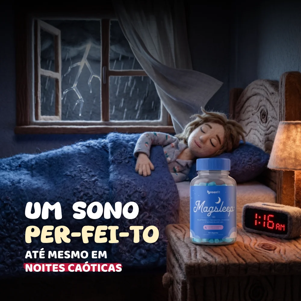
External-chaos contrast — protected sleep
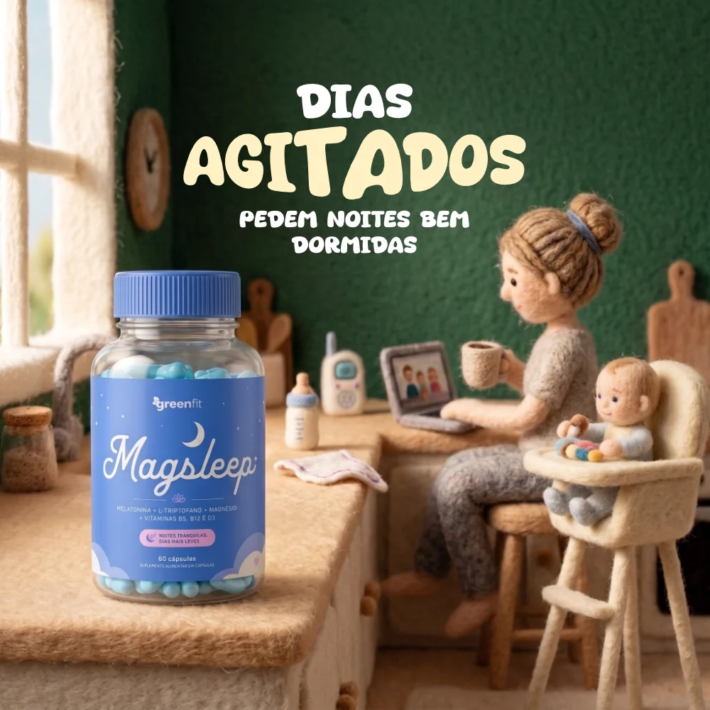
Handcrafted diorama — busy-parent routine

Whimsical visual pun — counting sheep diorama
Meta AdsStatic creativeDental / healthcare
Coire Odontologia — Dr. Paulo Rosa Jr.
A multidisciplinary dental clinic in Tatuí, São Paulo, Brazil.
Problem
The clinic covers several specialties — implants, Invisalign, whitening, extractions — but one generic ad couldn't speak to all of them. Patients search with very different mindsets: some are in pain and need reassurance fast, others are comparing local clinics on trust before booking.
What I did
Built a rotating set of static ads for Meta, each anchored to a single service and a specific persuasion angle instead of one generic message — always carrying either the clinic's registered brand or a named dentist with their CRO registration, in line with Brazil's dental advertising rules.
Conversion levers used
- Symptom-specific pain agitation — naming the exact discomfort (tooth pain, jaw pain, trouble chewing) instead of a vague promise.
- Fear-reversal + speed — "forget dentures," paired with a fast, concrete timeline.
- Cultural relatability — tying a routine filling to a very Brazilian moment, the barbecue.
- Named-expert authority — a real dentist with their CRO registration number, used on the personal-brand pieces to build individual trust alongside the clinic's institutional ads.
- Specific urgency — "72 hours," "2× faster," instead of unquantified urgency.
- Regulatory compliance as a trust signal — no real patient before/after photos, no guaranteed-result claims, no price-led offers: all restricted under CFO/CRO advertising rules for dentistry in Brazil.
Impact
These creatives run inside the same two-year paid-traffic partnership that grew the clinic's monthly revenue from R$150K to over R$360K.
View the full landing page case study →

Value-reframe hook — implants

Named-expert authority — Invisalign

Fear-reversal + speed — full-arch implants

Symptom-specific pain agitation — wisdom tooth extraction
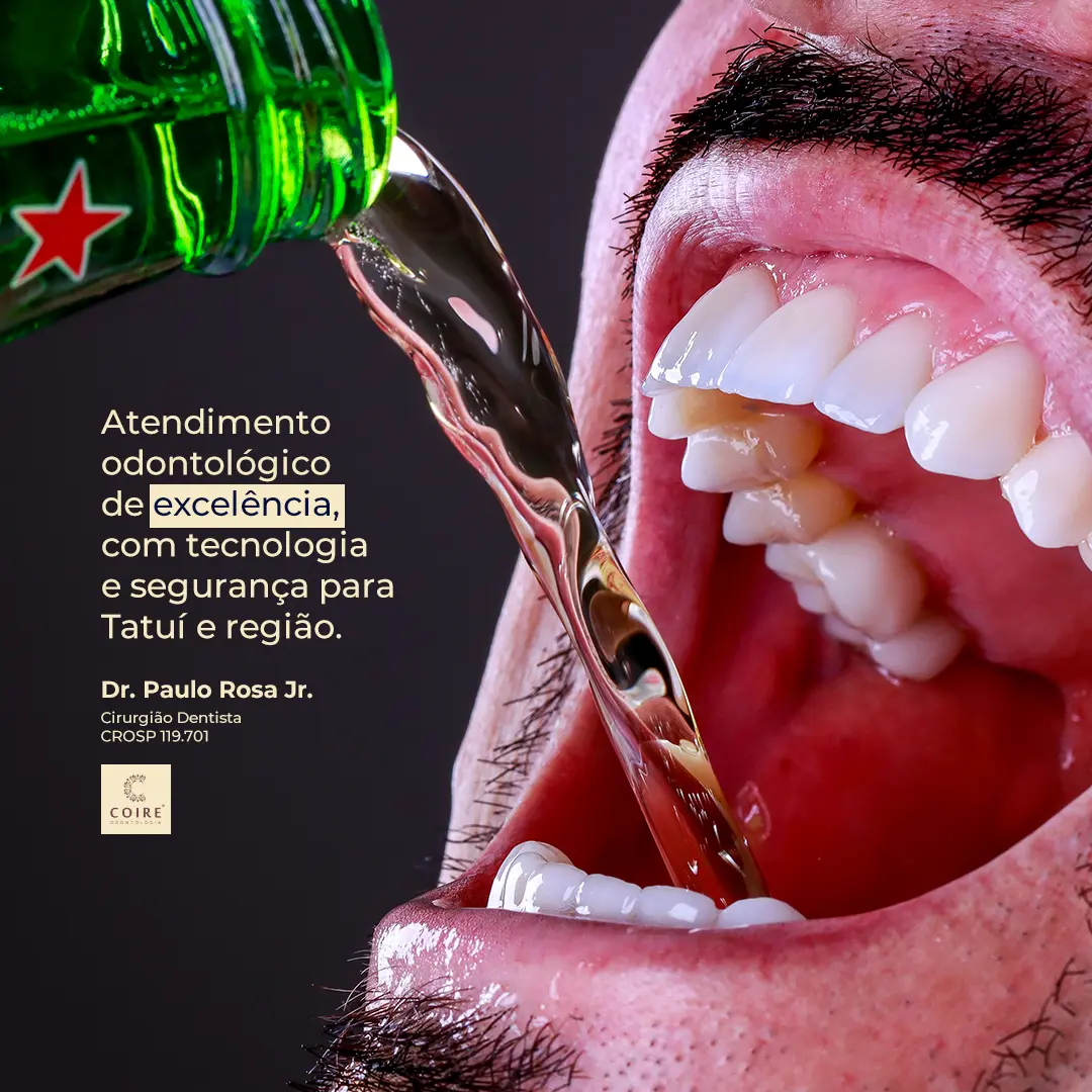
Local authority & trust — brand awareness

Cultural relatability hook — dental filling

Emotional-outcome hook — teeth whitening

Specific-timeframe urgency — implants
Meta AdsStatic creativeB2B / Collections
Acempre — Rede OK (Serasa Experian)
An authorized Serasa Experian distributor selling automatic-debit collection plans to Brazilian businesses that struggle with late payments.
Problem
Business owners and their administrative staff were losing hours every month manually chasing overdue invoices, dreading the follow-up calls and hoping the money would eventually land, with no automatic way to retry a failed payment.
What I did
Built a set of static ads for Meta inside one cohesive claymation-style visual world, literalizing four different collection pain points into concrete little-figure scenes instead of relying on UI mockups or stock photography.
Conversion levers used
- Literalized metaphor — overdue invoices as a haunting ghost, a client escaping down a rope: each pain point turned into a scene you register in one glance instead of a line of copy.
- Exaggerated character acting — the ghost's menace, the escaping client's panic, the beggar's slumped posture: stop-motion puppetry pushes each emotion further than a real photo or a flat illustration could.
- Role-specific pain — a frightened secretary answering the phone, an anxious business owner watching the money slip away: covering more than one person inside the buyer's business who feels this problem.
- Direct, unflinching language — headlines like "stop begging for client payment" name the exact humiliation of the task instead of a softened, corporate phrasing.
- Consistent product anchor — every scene closes on the same specific mechanism ("the Pix lands on its own," "the Acempre system"), so four very different stories still point at one single offer.
Impact
Built to test which pain-point resonates most across different buyer profiles — owners and admin staff — before scaling spend behind the strongest performer.

Literalized metaphor — overdue invoices as a ghost

Literalized metaphor — the client dodging payment

Role-specific pain — cutting the follow-up call

Direct, unflinching language — stop begging for payment
Meta AdsStatic creativeFintech / B2B
BullBank — Licensed Reseller Program
A Brazilian digital bank recruiting licensed resellers for its card machine business.
Problem
The reseller market is crowded with "make money fast" pitches, so prospects arrive skeptical. The ads needed to make a bold income claim — up to R$15,000/month — feel credible and specific, not like another empty promise.
What I did
Built a set of static and story ads for Meta aimed at prospective resellers, each reinforcing the same income ceiling from a different angle — a certification-style badge, a step-by-step benefit list, a real spokesperson — instead of repeating one generic pitch.
Conversion levers used
- Concrete income ceiling — the same specific number, "up to R$15,000/month," repeated and highlighted across every piece instead of a vague income promise.
- Risk-reversal specifics — low investment, break-even in the first month, no physical location required: answering the exact objections a skeptical prospect has before applying.
- Credential-style proof — a "Licensed 15K" ID-badge design that frames the income claim as a verified status, not a promise.
- Recurring-income reframe — "profit on every transaction," positioning the opportunity as an ongoing income stream, not a one-off payout.
- Relatable spokesperson — a real reseller pointing at the actual card machine, trading corporate polish for the kind of authenticity this audience trusts more.
Impact
These ads feed the same partner-acquisition funnel featured in the full case study, built to recruit resellers for BullBank's card machine business.
View the full case study →
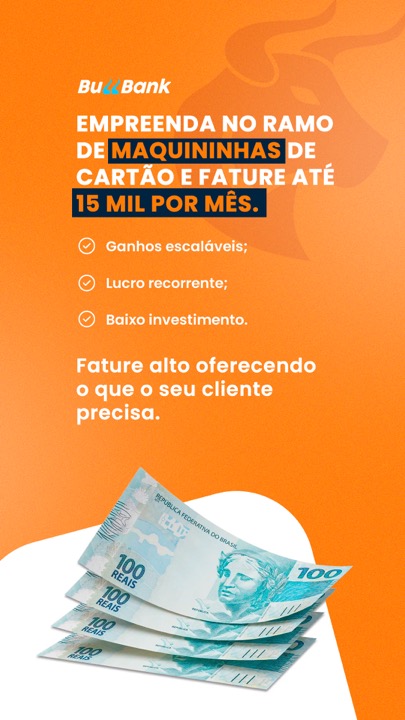
Concrete income ceiling — recruitment hook
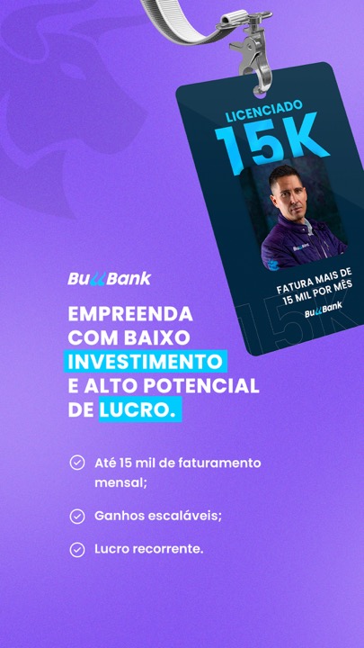
Credential-style proof — licensed badge
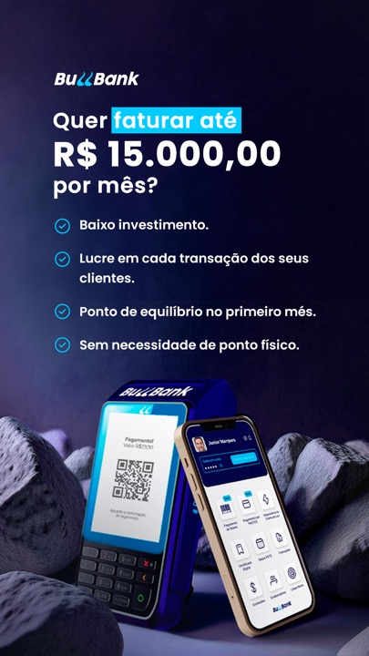
Risk-reversal specifics — objection handling

Relatable spokesperson — authenticity
Meta AdsStatic creativeLocal / Food delivery
Chama Verde — Vegan Delivery, Campinas
A vegan meal-delivery business in Campinas, São Paulo, competing for local search intent against far more established non-vegan options.
Problem
Vegan food still carries a taste bias — people assume it's bland or overpriced — and local competitors already dominate generic "food near me" searches.
What I did
Built a set of static ads for Meta leaning on three different proof formats — a search-intent mockup, a Google review screenshot, and a real Instagram comment — instead of relying on the food photography alone to make the case.
Conversion levers used
- Search-intent mimicry — an ad styled as a live Google search bar showing "Marmita vegana em Campinas," meeting people in the exact mindset they're already in.
- Platform-native social proof — a real Google review (verified Local Guide, 5 stars) reused as a self-contained ad, not just quoted.
- Skeptic-conversion narrative — an Instagram comment from a self-described meat-eater's partner, directly rebutting the "vegan doesn't taste good" objection in the customer's own words.
- Specific price anchor — "a partir de R$32,90" paired with visible plate variety, replacing a vague "affordable" claim with an exact number.
- Certification-style trust badge — a "100% Vegano" seal repeated across every piece: a stamped, verifiable claim instead of a marketing adjective.
Impact
Built to combine four different trust signals — search intent, review platforms, social comments and certification — so the offer doesn't rely on food photography alone to convert a skeptical audience.
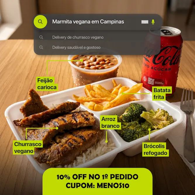
Search-intent mimicry — meal labeling
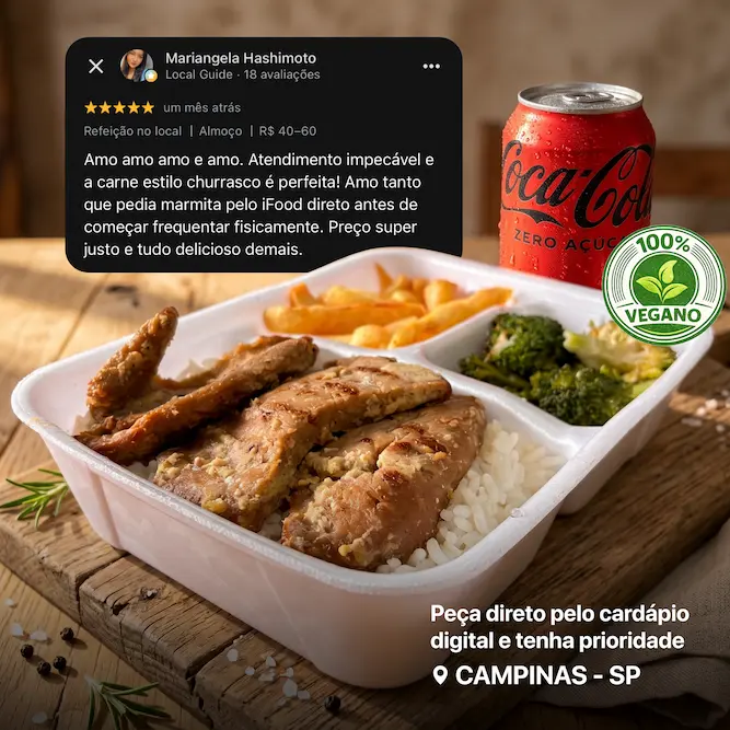
Platform-native social proof — Google review
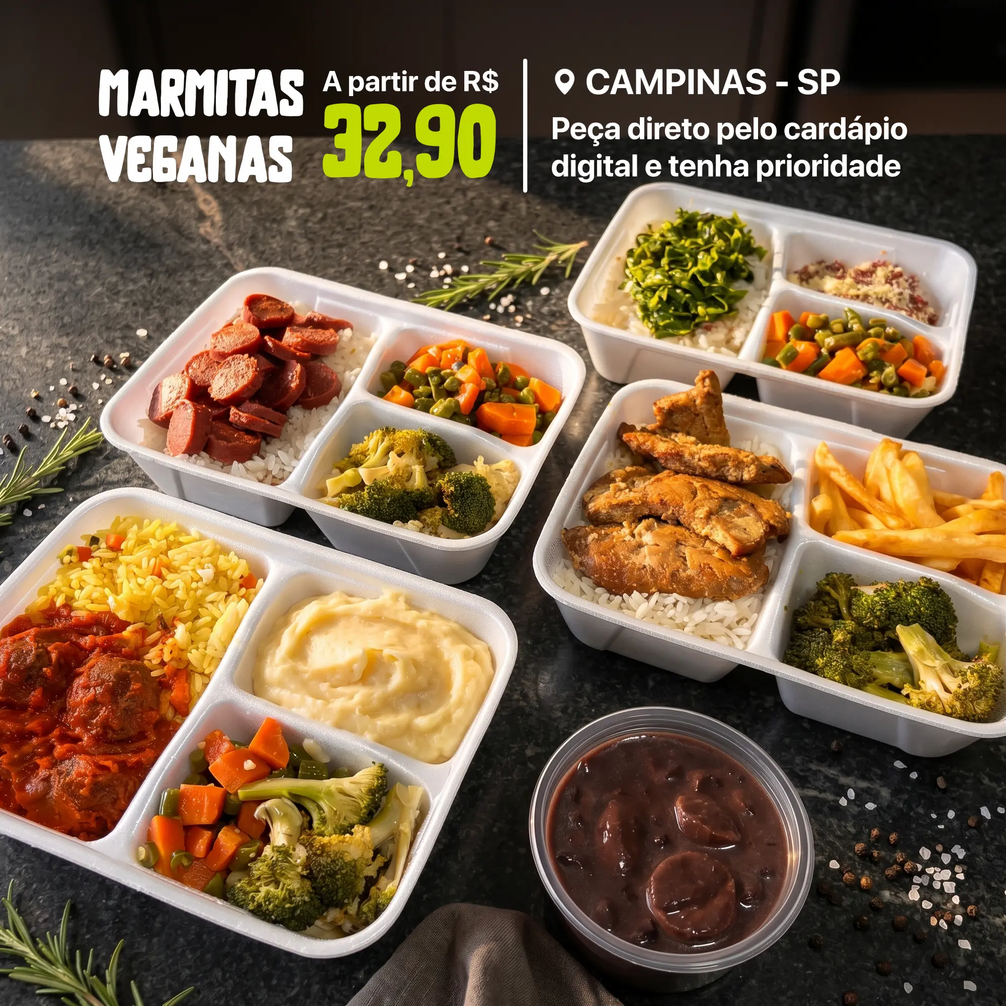
Specific price anchor — menu variety
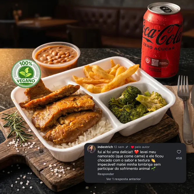
Skeptic-conversion narrative — Instagram proof
Meta AdsStatic creativeDigital product
Client Project — Digital Sticker Album
Ad creative built for a client who sells a low-ticket digital product: a complete, print-ready PDF set of 980 World Cup 2026 stickers, marketed directly to parents.
Problem
Parents buy physical sticker packs hoping to complete their kid's album, but end up overspending on duplicates with no guarantee of ever finishing it.
What I did
Built a set of static ads for this client's Meta campaigns, targeting parents specifically, not the kids, anchored on the same cost-reversal argument — stop gambling on physical packs — reinforced with a real kid's reaction and a checklist of guarantees.
Conversion levers used
- Cost-reversal hook — reframing the offer against money already being wasted on incomplete physical packs, not against doing nothing.
- Parent-as-buyer targeting — the copy speaks to the parent completing "the album for him," correctly identifying who actually pays even when the visual centers a happy kid.
- Real-reaction proof — an authentic photo of a kid's excited reaction, standing in for a testimonial in a product with no traditional client quote.
- Objection-specific guarantee badges — "all 980 cards," "no duplicates," "high-resolution PDF," pre-answering the three doubts a buyer has before checkout.
- Fixed, repeated price anchor — R$17,90 shown identically across every piece, so the offer's value never has to be re-justified from scratch.
Impact
Built to pre-answer the specific doubts a buyer has about a digital sticker product — completeness, duplicates, print quality — before they ever reach checkout.

Cost-reversal hook — parent-focused

Real-reaction proof — kid's excitement
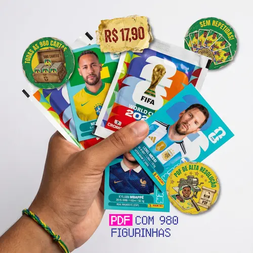
Objection-specific guarantees — product shot
Meta AdsStatic creativeEdTech / Digital product
Menina Peralta — Calq (Math UNO)
A digital educator selling teaching materials to teachers across Latin America.
Problem
Teachers were burned out re-explaining the same math drills, and kids were more engaged with their phones than with times tables — the product needed to sell to both people in the room: the teacher who buys it and the classroom it has to win over.
What I did
Built a set of static ads for Meta split between two angles — one for parents and teachers frustrated with screen time, one for the teacher's own exhaustion — each using real product photography instead of a mockup, since the physical card decks are the proof.
Conversion levers used
- Before/after split-frame — a literal black-and-white "problem" half next to a full-color "solution" half in the same image, making the transformation visible instead of just claimed.
- Dual-audience targeting — one creative speaks to the isolated kid glued to a phone, another to the exhausted teacher ("coffee + patience" mug), covering both people involved in the purchase decision.
- Recognizable-format borrowing — leaning on "UNO" as a mental shortcut, so the pitch is "the game you already know, teaching the subject you need" instead of explaining a new mechanic from scratch.
- Full product-breakdown transparency — an infographic disclosing exact card counts per deck, pre-answering "what exactly do I get" before checkout.
- Consistent, specific CTA — every piece ends on the same action, "download/view the PDF material," instead of a vague "learn more."
Impact
These creatives run inside the same infrastructure featured in the full case study — the client whose monthly revenue grew 10× within weeks running multiple digital products through paid traffic at once.
View the full landing page case study →

Before/after split-frame — screen time

Recognizable-format borrowing — the "UNO" hook
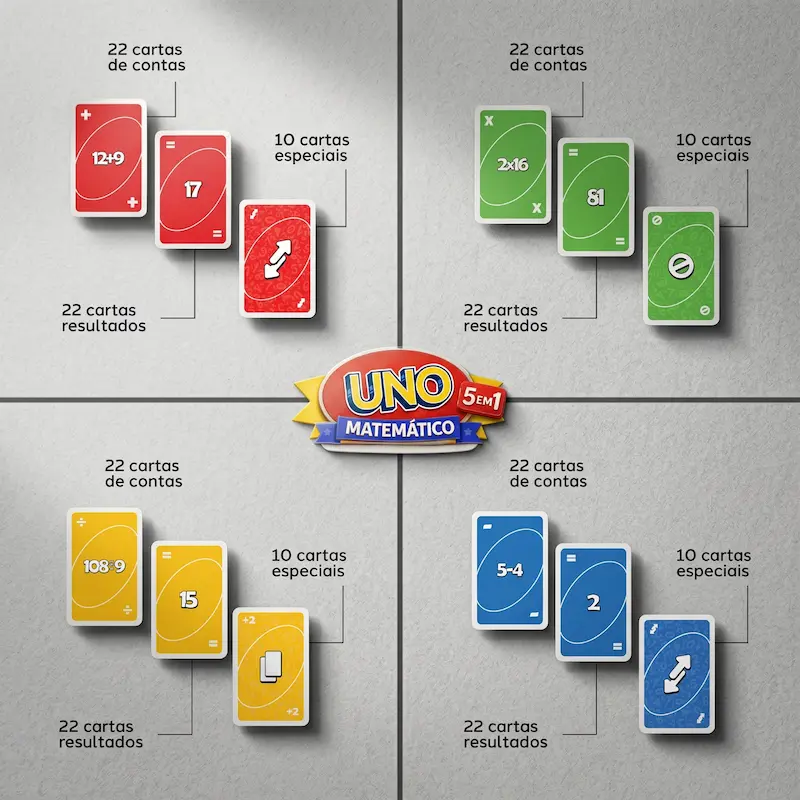
Full product-breakdown transparency

Dual-audience targeting — the teacher's exhaustion
Meta AdsStatic creativeChristian education / Digital product
Menina Peralta — Kit Davi e Golias (Sunday School)
The same digital educator, selling a printable Sunday-school activity kit to children's-ministry teachers across Brazil.
Problem
Every week, volunteer Sunday-school teachers were staring at a blank page on Saturday night, with no lesson plan, no printable activities and no time left to make any — the exact pain a R$9,90 kit needed to sell against.
What I did
Built a set of static ads leaning on formats these teachers already scroll past on Instagram — a crossed-out to-do list, a relatable comic strip, a reaction meme — instead of a straight product shot, so the ad felt like a post before it felt like a pitch.
Conversion levers used
- Crossed-out checklist — every item a teacher usually has to prep (scissors, glue, 500 sheets of paper, patience) struck through and replaced by one line: the kit, at R$9,90.
- Direct value-swap offer — a real ten-reais note next to the full kit, reframing the price as "trade this note for all of this," not an abstract number.
- Relatable meme format — a comic strip built on the exact dread ("Sunday's class only depends on you, teacher") this audience already jokes about, borrowing a format they already trust.
- Reaction-meme social proof — a widely recognized "shut up and take my money" meme paired with the real product photo, doing the selling without a single line of sales copy.
Impact
Runs on the same growth infrastructure as the rest of Menina Peralta's product line — landing pages, ad creative and WhatsApp automation working together, not competing for attention.
View the full landing page case study →

Direct value-swap — a R$10 note for the whole kit
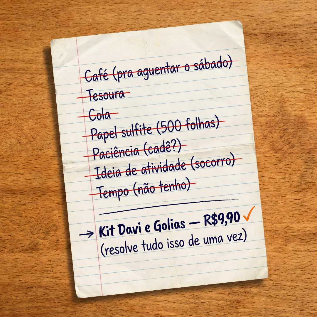
Crossed-out checklist — one line replaces the whole prep list

Relatable meme — the Sunday-class dread

Reaction meme + product proof — "shut up and take my money"